PORTFOLIO


Case study:
NOTER
Responsive Website
Project Overview
The problem
Available note taking websites have only limited access and not an open source for all users.
The goal
Our Design of Noter website to be user friendly by providing access to their contents or notes from anywhere by just log-in with their password .
The product
Noter is a new brand based on providing a open source platform for all, and offers licenses for personal, public and professionals. Noter goal is to make users access their notes from anywhere at anytime.
.
My role
UX designer leading the app and responsive website design from conception to delivery
Responsibilities
Conducting interviews, paper and digital wireframing, low and high-fidelity prototyping, conducting usability studies, accounting for accessibility, iterating on designs and responsive design.
Project duration
October 2021 to November 2021
Understanding the user
I conducted user interviews, which I then turned into empathy maps to better understand the target user and their needs. I discovered that many target users treat note taking as a regular habit when they need access from school or work. However, many note taking websites are overwhelming and confusing to navigate, which frustrated many target users. This caused a normally enjoyable experience to become challenging for them, defeating the purpose of relaxation.
Pain Points
1) Navigation
Note taking website designs are often complex, which results in confusing navigation
2) Interaction
Small buttons on websites make item selection difficult, which sometimes leads users to make mistakes
3) Access
User have limited access such as cloud storage only upto 2Gb, and access only upto a limited time
Personas & problem statements
John
John is a University student who needs a Note taking in a Responsive Website for his Desktop and mobile which he can access from anywhere at any time because he often forgets to keep his notes with him.
.png)
User journey map
I created a user journey map of John’s experience using the site to help identify possible pain points and improvement opportunities.
.png)
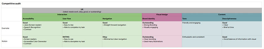
Competitive Audit
An audit of a few competitor’s products provided direction on gaps and opportunities to address with the Noter app.
_edited.jpg)
_edited.jpg)
Starting the design
Sitemap
The primary pain point for users is navigating through website, so I used that knowledge to create a sitemap.
My goal here was to make strategic information architecture decisions that would improve overall website navigation. The structure I chose was designed to make things simple and easy.
_edited.jpg)
Paper wireframe
Next, I sketched out paper wireframes for each screen in my app, keeping the user pain points about navigation, browsing, and checkout flow in mind.
The home screen paper wireframe variations to the right focus on optimizing the browsing experience for users.
Digital wireframe
Moving from paper to digital wireframes made it easy to understand how the redesign could help address user pain points and improve the user experience.
Prioritizing useful button locations and visual element placement on the home page was a key part of my strategy.
Digital wireframe for Variable screens
_edited.jpg)
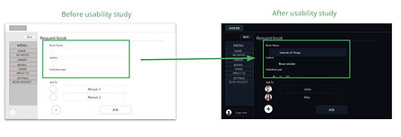
Usability study findings
To prepare for testing, I created a low-fidelity prototype which you can view here. I used this prototype to conduct an unmoderated usability study with 5 participants. Here are the main findings uncovered by the usability study:
1) Log-in
User have difficulty to create a new account and log in.
.
2) Take notes and save
Choose one of the book and take a note and save the notes.
.
3) Request
Users where searching for a requestpage
.
Refining the design
Mockups
Based on the insights from the usability study, I made changes to improve the user’s flow. One of the changes I made was adding the option to use sticky notes and calendar option. This allowed users more freedom to set or change their schedule without missing workflow.
Asking a book with Book’s name, year of publication, author helps to get the book quickly
_edited.jpg)
_edited.jpg)
Refined designs


High-fidelity prototype
High-fidelity prototype follows the same user flow as the low-fidelity prototype, and included the design changes made after the usability study, as well as several changes suggested by members of my team.
_edited.jpg)
View the Noter’s high-fidelity prototype
Responsive designs
The designs for screen size variation included mobile, tablet, and desktop. I optimized the designs to fit specific user needs of each device and screen size.
.
Mobile

Desktop

Accessibility considerations
1) Screen readers
Clear labels for interactive elements that can be read by screen readers
.
2) IA
Initial focus of the home screen on personalized recommendations help define the primary task or action for the user.
.
Going forward
Takeaways
Impact
Our target users shared that the design was intuitive to navigate through, more engaging with the images, and demonstrated a clear visual hierarchy.
.
What I learned
I learned that even a small design change can have a huge impact on the user experience. The most important takeaway for me is to always focus on the real needs of the user when coming up with design ideas and solutions. .
Next steps
1) Research
Conduct follow-up usability testing on the new website.
.
2) Features
Identify any additional areas of need and ideate on new features
.