PORTFOLIO

Case study:
CoffeeHouse
App
Project Overview
The problem
Persons in busy firm lack time to buy a coffee on-store.
The goal
Design an app for CoffeeHouse that allows users to easily order and pick up fresh, healthy dishes.
The product
CoffeeHouse is a regional coffee maker located in the suburbs of a metropolitan area. CoffeeHouse strives to deliver healthy, specialty coffee. They offer a wide variety of coffee. CoffeeHouse targets customers how are in a busy firm how lacks time to buy a coffee in a shop
.
My role
UX designer leading the app and responsive website design from conception to delivery
Responsibilities
Conducting interviews, paper and digital wireframing, low and high-fidelity prototyping, conducting usability studies, accounting for accessibility, and iterating on designs.
Project duration
August 2021 to September 2021
Understanding the user
I conducted interviews and created empathy maps to understand the users I’m designing for and their needs. A primary user group identified through research was working adults who need coffee when they wish to drink. This user group confirmed initial assumptions about CoffeeHouse customers, but research also revealed that time was the only factor limiting users to buy coffee. Other user problems included obligations, interests, or challenges that make it difficult to go to Coffee shops in-person.
Pain Points
1) Time
Persons working at busy firm have to spend time on standing in line and making their purchase
2) Accessibility
Platforms for ordering coffee are not equipped with assistive technologies.
3) IA
Text-heavy menus in apps are often difficult to read and order from
Personas & problem statements
Robert Jane
Robert Jane is a Busy professional who needs to order coffee for him and his coworkers because the all have the habit of drinking coffee.
_edited.jpg)
User journey map
I created a user journey map of Robert’s experience using the site to help identify possible pain points and improvement opportunities.
.png)
Competitive Audit
An audit of a few competitor’s products provided direction on gaps and opportunities to address with the CoffeeHouse app.
_edited.jpg)
.png)
Ideation
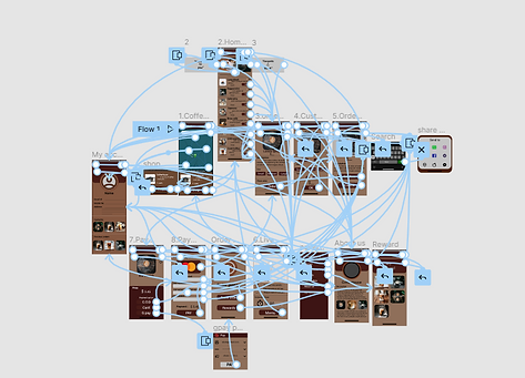
Taking the time to draft iterations of each screen of the app on paper ensured that the elements that made it to digital wireframes would be will-suited to address user pain points. For the home screen , I priotrized a quick and easy ordering process to help users save time.
.png)
Starting the design
Digital wireframes
As the initial design phase continued, I made sure to base screen designs on feedback and finding from the user research.
.png)
Usability study findings
To prepare for testing, I created a low-fidelity prototype which you can view here. I used this prototype to conduct an unmoderated usability study with 5 participants. Here are the main findings uncovered by the usability study:
1) Payments
People want more Payment option.
2) Personalization
People want more customization option.
3) Information
People needs better cue to move back to homepage.
Refining the design
Mockups
Early designs allowed for some customization, but after the usability studies, I added additional options to choose coffee cup, size, sugar cubes. I also revised the design so users see all the customization options when they first land on the screen.
.png)
The second usability study revealed color is not accessible to all users. Sugar offers only two option Low or high. I consolidated the sugar options into Quantity + and – button surrounded by circles, and I also changed the color by considering accessibility.
.png)
Accessibility considerations
1) Screen readers
Clear labels for interactive elements that can be read by screen readers
.
2) IA
Initial focus of the home screen on personalized recommendations help define the primary task or action for the user.
.
Refined designs
.png)
High-fidelity prototype
The final high-fidelity prototype presented cleaner user flows for selecting, customizing a coffee and checkout. It also met user needs for a pickup or delivery option as wellas more customization.
.png)
View the CoffeeHouse High-fidelity prototype
Going forward
Takeaways
Impact
The app makes the users feel like CoffeeHouse really thinks about how to meet their needs. One quote from peer feedback: “ The app made it easy to find nearest shop through map and customize my order Without wasting my time.”
.
What I learned
While designing the coffeeHouse app, I learned that the product we are designing should focus on users. t the first ideas for the app are only the beginning of the process. Usability studies and peer feedback influenced each iteration of the app’s designs
.
Next steps
1) Research
Conduct another round of usability studies to validate whether the pain points users experienced have been effectively addressed.
.
2) Features
Conduct more user research to determine any new areas of need and develop new version as an update.
.